Research
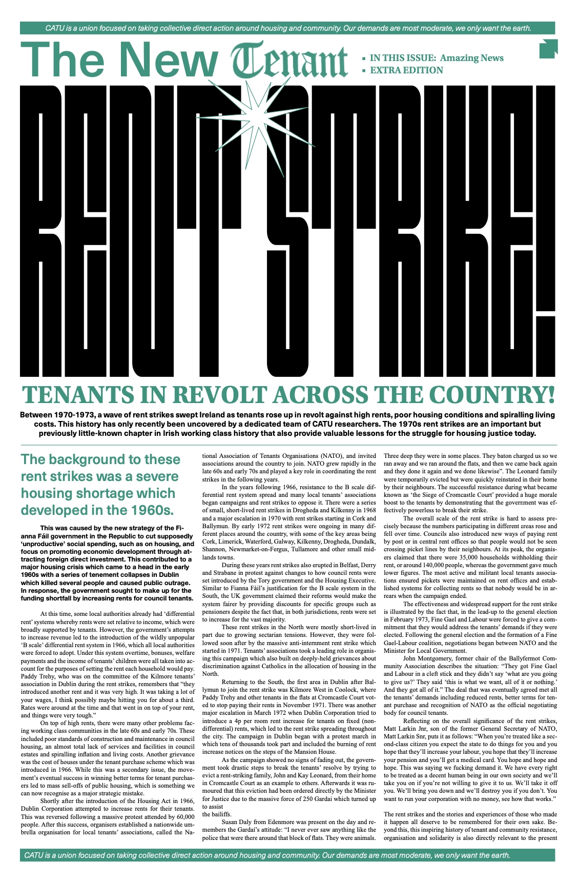
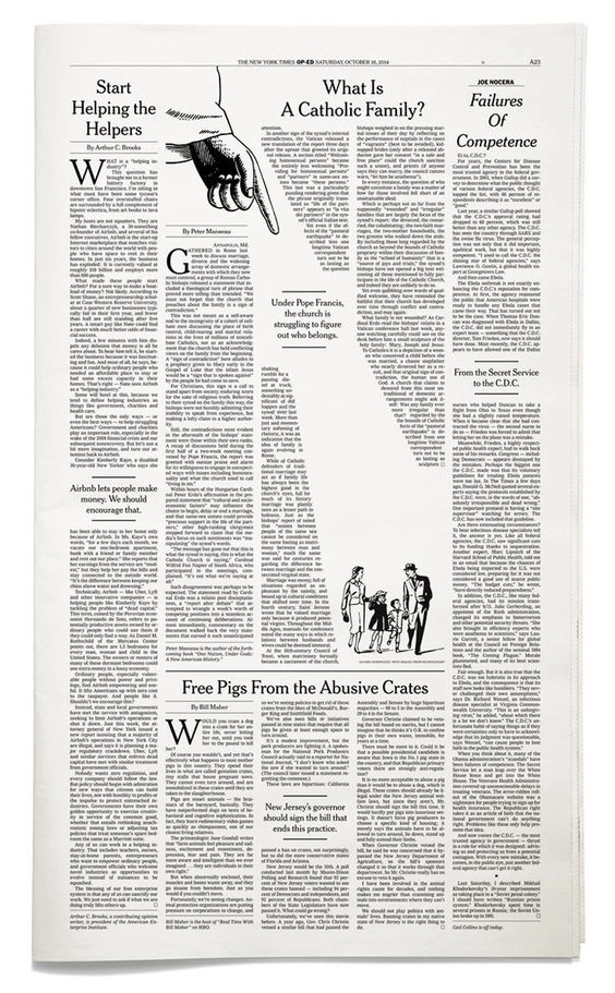
Exploring CATU's rich archive, I formed an approach based on balancing past and present. My research focused on minimalist broad-sheet designs.


Iterations
I wanted to adapt the former logo, and pair it with contemporary sans-serif typography. So I scanned and vectorised the script from CATU's archive.

Iterations
Experimenting with colour, I decided the print should remain monotone. Allowing the logotype and titles to shine.
